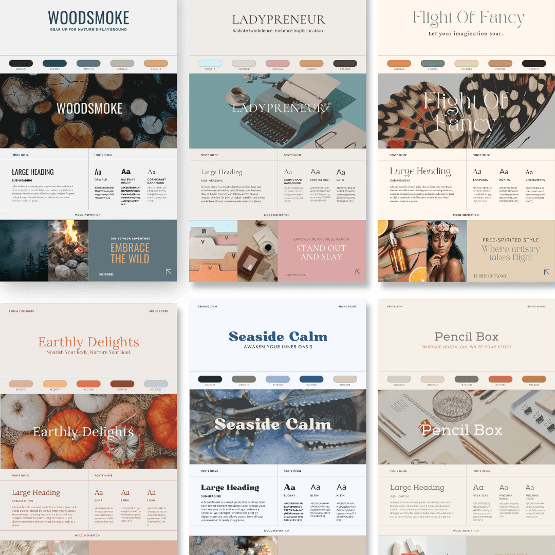
Brand Better: 12 modern color palettes to steal
Hey there, color enthusiasts and design aficionados!
Get ready to embark on a chromatic journey that'll make your creative heart skip a beat. In this blog post, we’re serving up not just one, not two, but a whopping twelve irresistible color palettes that will ignite your imagination and set your designs on fire!
Whether you're a solopreneur, a DIY enthusiast, or a design-savvy dreamer, we've got you covered. But hold onto your Pantone swatch books because that's not all!
We're also gifting you a Canva template set featuring all 12 color palettes PLUS coordinating brand fonts.
Imagine having all twelve dazzling color palettes at your fingertips, perfectly paired with coordinating font combinations, neatly organized on a stylish brand board. It's like having a personal design genie granting your every chromatic wish. So, buckle up and get ready for a visual feast that will leave you inspired, excited, and armed with the tools to create show-stopping designs.
Be sure to scroll down to find out how to download your own {free} perfectly coordinated color palette & font brand board set based on these color palettes!
Let's dive in and unleash the power of color!
Ladypreneur
Alright, folks, let's talk about the fabulous "ladypreneur" color palette. This baby is all about channeling that soft and modernly feminine vibe, perfect for brands that are ready to kick butt in the business world alongside ambitious women entrepreneurs. We've carefully handpicked these colors to give off a sense of sophistication and professionalism, all while maintaining that oh-so-important feminine touch.
The star of the show is the primary color, #D2EFF5, which brings tranquility and trust to the party, making your brand ooze confidence. Now, let's not forget about its buddies: the complementary shades of #DCD5CD, #DAA7A6, and #D09C77. These bad boys offer a subtle and elegant contrast, bringing qualities like elegance, warmth, and approachability to the table. And the cherry on top? The rich, dark tone of #4A433D, adding depth and grounding to the whole shebang.
Brands that would love using this palette:
If you're in the beauty, fashion, coaching, or lifestyle niches, targeting fierce women seeking that perfect balance between professionalism and femininity, this color palette is the bee's knees. It'll help you rock a brand identity that's strong, empowering, and unapologetically graceful.

ladypreneur
Soft & modernly feminine for the lady who means business
HEX CODES:
#D2EFF5
#DCD5CD
#DAA7A6
#D09C77
#4A433D
Woodsmoke
Next up is the captivating "Woodsmoke" color palette. Picture this: it's earthy, cool, and has just the right amount of warm vibes to make you go, "Mmm, yes, I dig it." These colors are like a cozy campfire on a cool autumn night, bringing that rustic charm with a touch of sophistication.
First up, we have #232C27, a deep, mysterious shade that'll make you feel like you're wandering through a dense forest. Next, we've got #284854, a cool and calming hue reminiscent of a serene mountain lake. Then we've got #60747C, a versatile color that's like the perfect pair of worn-in denim—effortlessly cool. Now, let's talk about #B8B8AA, a lovely neutral tone that adds a touch of elegance, just like a classy wooden accent piece in a well-decorated cabin. Finally, we round it off with #D9A774, a warm and comforting shade that's like snuggling up in a cozy blanket by the fireplace.
Brands that would love using this palette:
So, who would rock these earthy yet cool colors? Brands in the outdoor, adventure, eco-friendly, or lifestyle spaces would find this palette perfect for capturing that natural, down-to-earth spirit.
Whether you're a sustainable clothing brand, a hip outdoor gear retailer, or a nature-inspired lifestyle blog, the "Woodsmoke" palette will bring that irresistible earthy charm to your brand's visual identity. So, get ready to embrace the wilderness and let these colors take your brand on an adventurous journey!

Woodsmoke
Earthy yet cool, with a hint of warm
HEX CODES:
#232C27
#284854
#60747C
#B8B8AA
#D9A774
Let's take a wild ride into the whimsical world of the "Flight Of Fancy" color palette. Get ready for a blend of neutral warm tones that'll make you go, "Oh, hello there!" And just when you think it can't get any better, we're throwing in some muted jewel tones to spice things up. It's like the perfect balance between cozy and fancy. So, let's meet the stars of this show!
First, we've got #DD8E58, a deliciously warm shade that's as comforting as a freshly baked cinnamon roll. Then, say hello to #708A81, a serene hue that brings to mind a secret garden hiding in the depths of your imagination. And let's not forget about #E5D1B8, a neutral tone that's like that effortlessly chic outfit you always reach for. Now, brace yourself for #C2956E, a touch of muted jewel tone that adds just the right amount of pizzazz. And finally, we have #2B2129, a deep and mysterious shade that's like the hidden gem in a treasure chest.
Brands that would love using this palette:
Now, who would rock these marvelous colors? Picture brands in the realms of bohemian fashion, indie artisan goods, or even whimsical home decor. If you're all about embracing your free-spirited side and radiating a sense of playful elegance, the "Flight Of Fancy" palette is your ticket to visual bliss.
So, hop on this magical color journey and let your brand soar with creativity and a touch of enchantment!

Flight Of Fancy
Neutral warm tones accented with just the right amount of muted jewel tones
HEX CODES:
#DD8E58
#708A81
#E5D1B8
#C2956E
2B2129
Flight of Fancy
Get ready to groove to the beat of the "Take Five" color palette, my friend! It's like a smooth jazz tune with a surprising twist. This palette starts off with a hushed, understated vibe, but then bam! throws in a pop of pink to shake things up. Let's break it down, shall we?
We've got #475F61, a mysterious hue that's like a secret rendezvous in a dimly lit jazz club. Then we've got #93979A, a cool and collected tone that's as smooth as silk. Moving on, we have #BBBBC3, a touch of sophistication that adds a touch of class, like a suave saxophone player stealing the show. Now, hold onto your hats because here comes #F0EEF1, a quiet shade that's like a whispered promise of tranquility. And finally, we're hit with a pop of pink in #EFBDC8, adding that unexpected spark that makes you go, "Oh, snap!"
Brands that would love using this palette:
So, who's grooving with these colors? Think about brands in the realm of modern art, lifestyle blogs with a touch of sass, or even edgy fashion boutiques. If you want to create an atmosphere that's effortlessly cool, yet playfully unconventional, the "Take Five" palette is your jam. So, put on your snazzy outfit, grab a cocktail, and let these colors transport you to a world where sophistication meets a delightful twist. It's time to take five and let your brand shine!
Free download
InstaBrand: Your shortcut to stylish Canva Branding
Up-level your visual brand aesthetic in minutes! Grab Your Free Canva Template set featuring all 12 of these stunning color palettes alongside perfectly coordinated brand fonts.
Instantly ready for you to use inside of Canva!

Take Five
A quiet palette punched up with a pop of pink.
HEX CODES:
#475F61
#93979A
#BBBBC3
#F0EEF1
#EFBDC8
Earthly Delights
Hold onto your pumpkin-spiced lattes, folks, because we're about to dive into the whimsical world of "Earthly Delights" color palette.
Picture this: colors that are like a surprise gift from Mother Nature herself, inspired by the bountiful harvest season. We've got unexpected hues that'll make you go, "Whoa, that's delightful!" So, let's roll with the colors of the autumn breeze, shall we?
First up, we've got #D9B09D, a warm and cozy shade that's like wrapping yourself in a fuzzy blanket. Then, say hello to #EDB97F, a hue that brings to mind the golden rays of a sunset on a crisp fall evening. Now, brace yourself for #DD7450, a fiery color that's like the crackling bonfire at a harvest festival. And let's not forget about #8D4936, a rich and earthy tone that's as comforting as a homemade apple pie. Finally, we have #C0CAD2, a cool and serene shade that's like gazing at the starry night sky.
Brands that would love using this palette:
So, who would rock these earthy delights? Think of brands in the realm of farm-to-table restaurants, artisanal crafts, or even nature-inspired wellness products. If you're all about celebrating the beauty of the harvest season and embracing that rustic charm, the "Earthly Delights" palette is your ticket to visual bliss.
So, grab your flannel shirt, jump in a pile of leaves, and let these colors bring that cozy autumn magic to your brand. It's time to fall head over heels for these earthy delights!
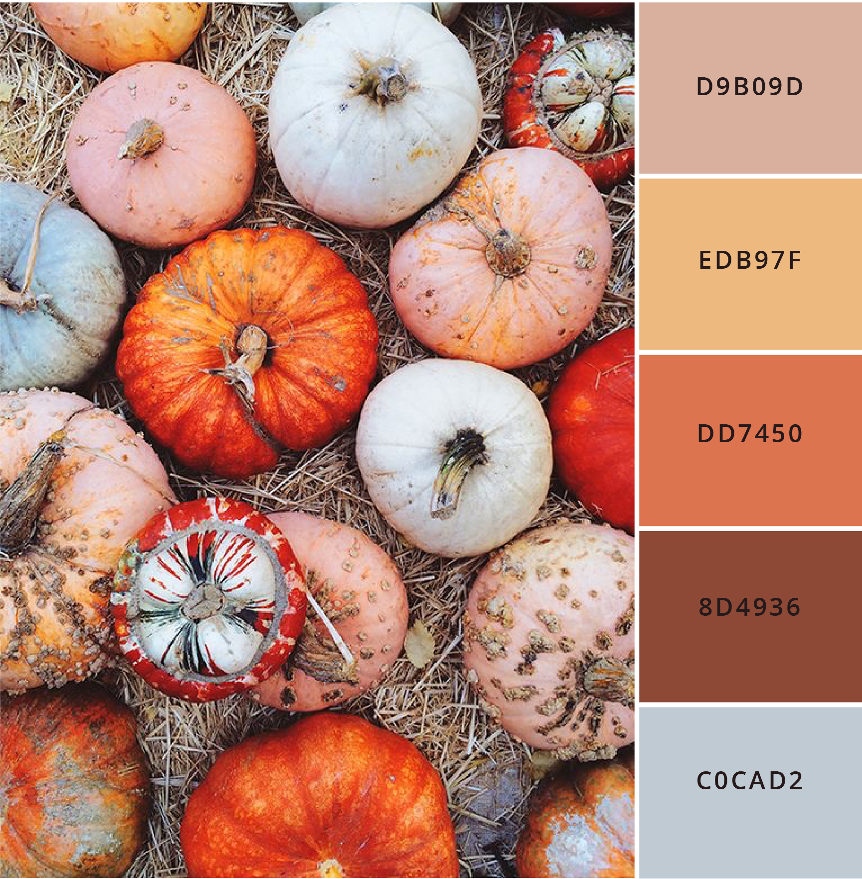
Earthly Delights
Unexpected hues inspired by the harvest season
HEX CODES:
#D9B09D
#EDB97F
#DD7450
#8D4936
#C0CAD2
Mountain Bloom
Get ready to frolic through the meadows of the "Mountain Bloom" color palette, my friends! These warm and subdued pastels are like a bouquet of wildflowers that burst into bloom after a refreshing rain shower.
Let's set the scene: imagine rolling hills covered in a kaleidoscope of delicate hues. We've handpicked these colors to give you that whimsical charm you never knew you needed. So, let's take a closer look, shall we?
First up, we've got #CFB1B3, a soft and rosy shade that's like a gentle caress on a sunny day. Then we have #BC7B7D, a muted pastel that's as charming as a shy wildflower peeking out from the grass. Brace yourselves for #DAB457, a warm and golden hue that brings to mind fields of dandelions dancing in the breeze. And let's not forget about #6F7A53, a fresh and earthy tone that's like moss-covered rocks nestled among the flowers. Finally, we have #C9C7AF, a serene and soothing shade that's like gazing at the misty mountains in the distance.
Brands that would love using this palette:
So, who would embrace these enchanting colors? Picture brands in the realm of bohemian fashion, nature-inspired home decor, or even eco-friendly lifestyle products. If you want to capture that ethereal beauty of wildflowers and create a brand that exudes a sense of tranquility and natural elegance, the "Mountain Bloom" palette is your secret weapon.
So, put on your flower crown, embrace your inner free spirit, and let these colors transport you to a world where wildflowers reign supreme. It's time to let your brand bloom with beauty and grace!
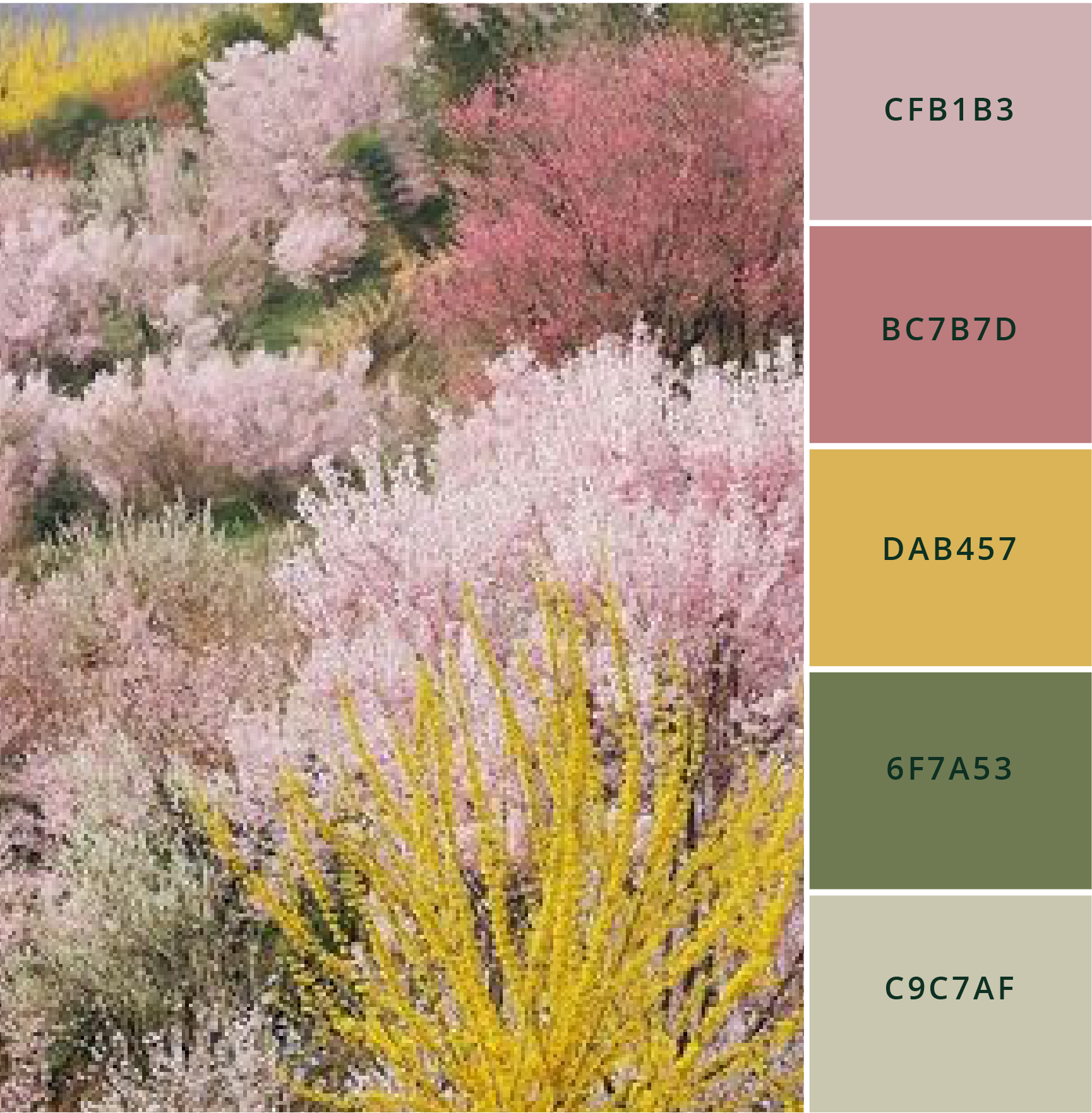
Mountain Bloom
Warm, subdued pastels that come out after the rain
HEX CODES:
#CFB1B3
#BC7B7D
#DAB457
#6F7A53
#C9C7AF
Spice & Soul
Hold onto your sun hats, folks, because we're about to bask in the warm glow of the "Spice & Soul" color palette. Picture this: colors that are like a sun-kissed embrace straight from the picturesque Middle Eastern and Mediterranean locales. We're talking about warm, golden intensity that'll make you go, "Oh, hello there, sunshine!" So, let's take a trip to golden paradise, shall we?
First up, we've got #DDBF8F, a hue that's as radiant as a desert sunset, casting a warm glow on everything it touches. Then, say hello to #D6A531, a rich golden tone that's like diving into a pool of liquid gold. Now, brace yourself for #AF6A02, a fiery and spicy shade that's like a sprinkle of saffron in your favorite dish. And let's not forget about #571B01, a deep and mysterious color that's as captivating as the hidden alleys of an ancient marketplace. Finally, we have #OC1301, a daring and vibrant hue that's like a splash of pomegranate juice bursting with flavor.
Brands that would love using this palette:
So, who would rock these golden beauties? Picture brands in the realm of sun-kissed swimwear inspired by exotic destinations, luxury resorts, or even artisanal spice blends. If you want to infuse your brand with that warm, sun-drenched allure and create an atmosphere that's both vibrant and enticing, the "Spice & Soul" palette is your golden ticket.
So, put on your shades, sip on a refreshing cocktail, and let these colors transport you to a world where every moment feels like the most magical hour of the day. It's time to let your brand shine with golden intensity!

Spice & Soul
Warm, golden intensity
HEX CODES:
#DDBF8F
#D6A531
#AF6A02
#571B01
#OC1301
Seaside Calm
Ahoy, sea lovers! Get ready to dive into the soothing depths of the "Seaside Calm" color palette. We're talking about calming blues and sophisticated neutrals that'll transport you straight to the tranquil world of underwater wonders. Picture this: hues inspired by the unexpected shades found on crustaceans and mysterious sea creatures.
So, let's swim with the colors of the ocean, shall we?
First up, we've got #232C31, a deep and mysterious shade that's like diving into the depths of the sea, where secrets are whispered among the waves. Then, say hello to #807975, a sophisticated neutral tone that's like discovering a hidden treasure in the sand. Now, brace yourself for #97B1D2, a serene and dreamy blue that's as calming as a gentle ocean breeze on a sunny day. And let's not forget about #2E5B88, a vibrant and invigorating color that's like the playful dance of dolphins in the surf. Finally, we have #D6C9BB, a soft and comforting hue that's like the delicate touch of sea foam on your toes.
Brands that would love using this palette:
So, who would ride the waves of these coastal delights? Picture brands in the realm of seaside retreats, wellness spas with an ocean-inspired theme, or even sustainable seafood restaurants. If you want to create a brand that exudes a sense of tranquility, elegance, and a deep connection to the sea, the "Seaside Calm" palette is your tide-turning secret. So, grab your snorkel, embrace the serenity of the ocean, and let these colors whisk you away to a world where peace and beauty reign beneath the waves.
It's time to sail the seas of "Seaside Calm" and let your brand make waves in the most calming way!
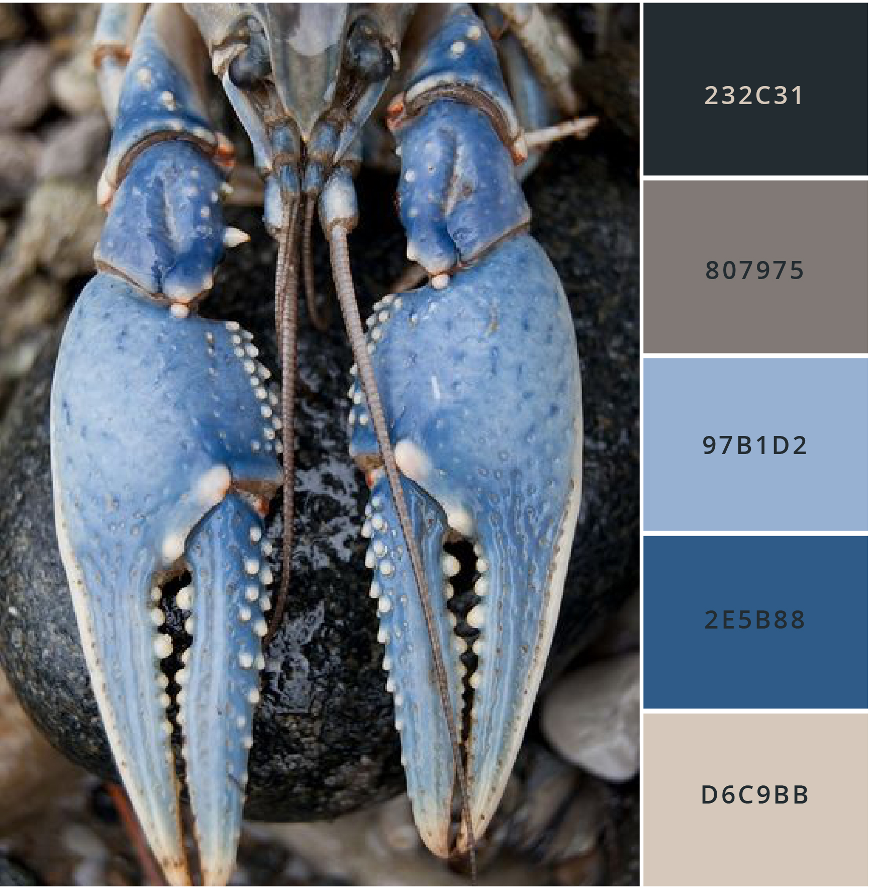
Seaside Calm
Calming blues and sophisticated neutrals
HEX CODES:
#232C31
#807975
#97B1D2
#2E5B88
#D6C9BB
Bakers Dozen
Alright, let's whip up some delicious designs with the "Baker's Dozen" color palette. These beautiful hues are like aged metallics you'd find in a busy kitchen where culinary magic happens. Picture this: the glimmer of well-worn pots and pans that have seasoned many delectable creations.
So, grab your apron, and let's explore these mouthwatering shades! First up, we've got #D5D9DA, a silvery tone that's as shiny as a well-polished whisk, adding a touch of sophistication to any design. Then, say hello to #BDC8C4, a muted and subtle shade that's like a patina of experience on a trusty baking sheet. Now, brace yourself for #71827A, a greenish-gray hue that's as versatile as a multitasking chef's knife, effortlessly blending into any culinary masterpiece. And let's not forget about #637372, a deep and moody color that's like the rich, velvety texture of a perfectly baked chocolate cake. Finally, we have #72402B, a warm and earthy tone that's like the comforting aroma of freshly baked bread straight out of the oven.
Brands that would love using this palette:
So, who would savor these delectable colors? Picture brands in the realm of artisanal bakeries, trendy cooking utensils, or even food blogs that showcase scrumptious recipes. If you want to add a pinch of warmth, a dash of culinary nostalgia, and a sprinkle of elegance to your brand, the "Baker's Dozen" palette is your secret ingredient. So, roll up your sleeves, dust your hands with flour, and let these colors whisk you away to a world where creativity and culinary delights collide. It's time to bake up a visual feast that'll leave your audience hungry for more!

Baker’s Dozen
Beautiful colors inspired by aged metallics found in the kitchen
HEX CODES:
#D5D9DA
#BDC8C4
#71827A
#637372
#72402B
Pencil Box
Alright, listen up, folks! We've got a color palette that'll make your inner office nerd squeal with delight. Say hello to "Pencil Box" – a collection of classic neutrals with a cheeky pop of color inspired by those vintage rubber erasers that used to sit on our desks.
Get ready to embrace the nostalgia and let's dive into these retro hues! First up, we've got #D2CEC2, a creamy shade that's as smooth as a well-worn pencil eraser, ready to erase any design mishaps. Then, there's #E0D5C1, a gentle and warm tone that's like the comforting touch of an eraser on a crinkled piece of paper. Now, let's spice things up with #7A7570, a cool and versatile gray that adds a touch of sophistication to your creative endeavors. But wait, here comes the star of the show – #C97253, a bold and vibrant color that's like that one quirky eraser in the bunch, making a statement amidst the sea of neutrals. And finally, we have #BC804E, a warm and earthy hue that's like the comforting smell of fresh ink on a well-used notebook.
Brands that would love using this palette:
So, what kind of brands would rock this playful palette? Imagine stationery boutiques, creative agencies with a touch of whimsy, or even podcasters who embrace the power of pen and paper. If you want to add a sprinkle of retro charm, a dash of creativity, and a pop of personality to your brand, the "Pencil Box" palette is your ticket to office-inspired awesomeness.
So, grab your favorite pen, doodle your heart out, and let these colors transport you back to the golden days of handwritten notes and imaginative scribbles. It's time to unleash your inner office geek and make your brand shine brighter than a freshly erased page!

Pencil Box
Classic neutrals with a pop of color
HEX CODES:
#D2CEC2
#E0D5C1
#7A7570
#C97253
#BC804E
Harvest Jewels
Hey there, color enthusiasts! Feast your eyes on the "Harvest Jewels" color palette. It's like a garden party for your design senses, combining lush greens and vibrant purples inspired by nature's bountiful hues. Get ready to sow some creative seeds and watch them bloom!
First up, we've got #3A3E4A, a deep and mysterious shade that's as enigmatic as a hidden garden path. Then, there's #E3E6EF, a soft and dreamy tone that's like the delicate petals of a blooming flower, adding a touch of elegance to your designs. Now, brace yourself for #ADA0AE, a dusty purple that's as charming as a lavender field in full bloom, captivating attention with its subtle allure. But wait, there's more! #ABB9B9 is a cool and calming shade of green, reminiscent of fresh leaves swaying in the gentle breeze, invoking feelings of tranquility and balance. And finally, we have #ADB77E, a warm and earthy green that's like the vibrant foliage of a thriving garden, injecting a sense of energy and growth into your visual creations.
Brands that would love using this palette:
So, what kinds of brands would embrace this verdant and regal palette? Picture organic skincare lines, sustainable fashion brands, eco-conscious home decor, or even wellness retreats that celebrate the healing power of nature. If you want to infuse your brand with a harmonious blend of natural beauty, serenity, and a touch of regality, the "Harvest Jewels" palette is your secret garden of inspiration.
Now, put on your gardening gloves, grab your creative tools, and let these colors transport you to a world where imagination and nature intertwine. It's time to harvest the visual wonders that await you!

Harvest Jewels
A beautiful blend of greens and purples found in the garden.
HEX CODES:
#3A3E4A
#E3E6EF
#ADA0AE
#ABB9B9
#ADB77E
African Azure
Alright, my colorful compadres, get ready to be dazzled by the "African Azure" color palette! It's like stepping into an African marketplace filled with vibrant textiles and a treasure trove of turquoise blues. We've curated a monochrome masterpiece that'll have your eyes popping and your creative juices flowing.
Let's dive into this chromatic adventure! First up, we've got #0E3022, a deep and mysterious shade that's as rich as the African soil itself, grounding your designs with earthy elegance. Then, there's #30635C, a mesmerizing hue that captures the essence of deep ocean depths, evoking a sense of tranquility and introspection. Now, brace yourselves for #44918B, a vibrant turquoise that's as refreshing as a cool breeze on a scorching day, injecting energy and vibrancy into your visual creations. But wait, there's more! #DCF0EF is a serene and soothing shade of blue, reminiscent of clear tropical waters, invoking feelings of peace and harmony. And finally, we have #7D6A4C, a warm and rustic brown that's like the sun-kissed savannah, adding a touch of organic beauty to your designs.
Brands that would love using this palette:
So, which brave brands would rock this bold and beautiful palette? Imagine fashion labels that celebrate cultural diversity, home decor brands that embrace global inspirations, eco-conscious jewelry artisans, or even travel companies offering immersive African experiences. If you want to infuse your brand with the spirit of adventure, the allure of exotic destinations, and a splash of vibrant elegance, the "African Azure" palette is your ticket to chromatic bliss.
Now, grab your creative passport, unleash your inner wanderlust, and let these colors transport you to the enchanting world of African wonders. It's time to hang some visual jewels and make your brand shine brighter than a Saharan sunset!
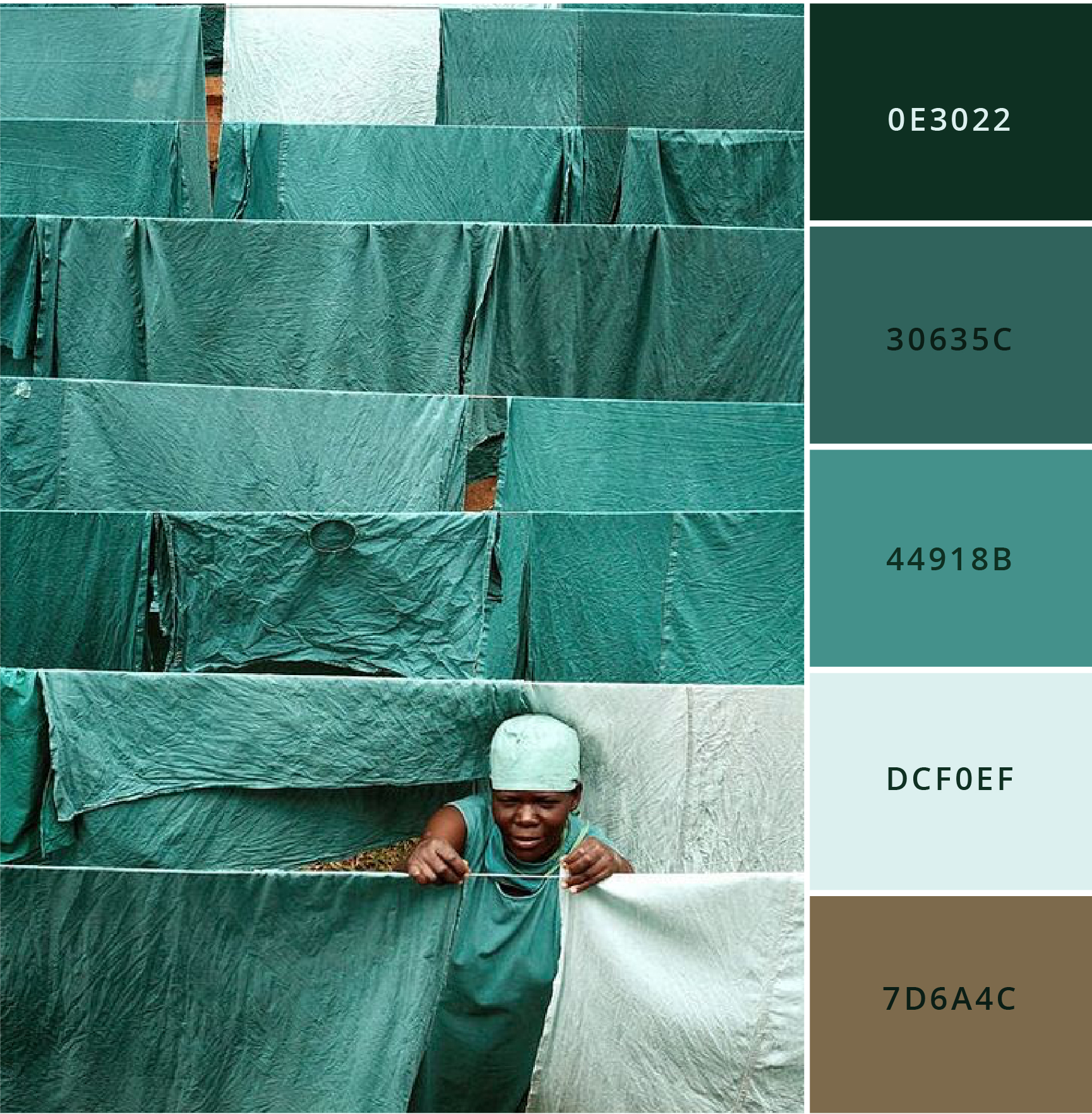
African Azure
A gorgeous monochrome palette of turquoise blues.
HEX CODES:
#0E3022
#30635C
#44918B
#DCF0EF
#7D6A4C
free download
InstaBrand: Your shortcut to stylish Canva branding.
Up-level your visual brand aesthetic in minutes! Grab Your Free Canva Template set featuring all 12 of these stunning color palettes alongside perfectly coordinated brand fonts.
Instantly ready for you to use inside of Canva!