Color psychology: what do your brand colors say about you?

Ever wonder why you feel a certain way when you walk into a new setting? A lot of it has to do with color psychology. When you’re at the spa, you want to feel calm, relaxed and cared for. That generally translates to calm blues, greens and nurturing shades of pink.
Contrast that with getting pumped up for your favorite spin class. Now we’re talking about bright yellows, and confident orange hues.
Humans are visual creatures. We perceive up to 80% of our impressions from sight. This means you’ll want to carefully consider your brand colors because they’re sending signals and cues to your potential clients that you may not even be aware of.
It’s easy to go down the color psychology rabbit hole (or is that just me??) So to simplify it for you, I’ve pulled together a few basic colors and their associated meanings.

yellow color psychology
A truly joyous and radiant color. It’s the color of high energy, enthusiasm, hope, fun, and cheerfulness. It means happiness and optimism and is the color of sun shining, bright light and creativity.
Bright yellow is great for clearing the mind. eBut if the color is too faded it might mean lack of confidence. Dark yellow, the color of the cynic and complainer, represents the presence of melancholy, lack of love and even depression.
A lemon-yellow means a need for order in life. Citrine yellow stands for emotional instability and deceptions, as it will never take on serious responsibilities. Golden yellow, more sensitive to criticism, represents curiosity and the attraction towards investigations. A cream yellow encourages the creation of new ideas.
source: www.colorpsychology.org

white color psychology
White is the lightest color, meaning purity, innocence, simplicity, cleanliness and integrity. It is also considered to represent perfection, as it is the purest and most complete color.
White represents new beginnings; like a fresh piece of white paper without writing. It leaves the mind open; free to create what comes to it.
While it brings calmness, comfort, and hope, too much can also feel empty, sterile, distant, boring, or cold.
source: www.colorpsychology.org

orange color psychology
Orange is the color of adventure and social communication. It is a color that will always help us look on the bright side of things because it’s optimistic and extroverted- the color of the uninhibited. It’s courageous and inspires onward and upward action and makes us feel stronger from a physical point of view.
On the flip side, it’s full of rejuvenation, helping to restore balance to our physical energies.
While orange is sociable, enthusiastic, cheerful, self-confident and uninhibited, it can also be superficial, self-indulgent, and overly proud.
source: www.colorpsychology.org

red color psychology
The single most dynamic and passionate color, it symbolizes love, rage and courage. It’s also associated with energy, life, passion, and action; helping to excite the emotions and motivate people to act.
Red is often used to express love, but it can also relate to sexuality and lust, rather then just love which is expressed more with pink
The energy of Red actually has an effect on our physiological state by increasing heart rate and making us breathe faster.
The positive aspects are that it represents love, activity, energy, attention, and power. The negative aspects refer to aggression, dominance that instills fear, danger, and stress. It’s a basic and important color, but one that needs to be used thoughtfully.
source: www.colorpsychology.org
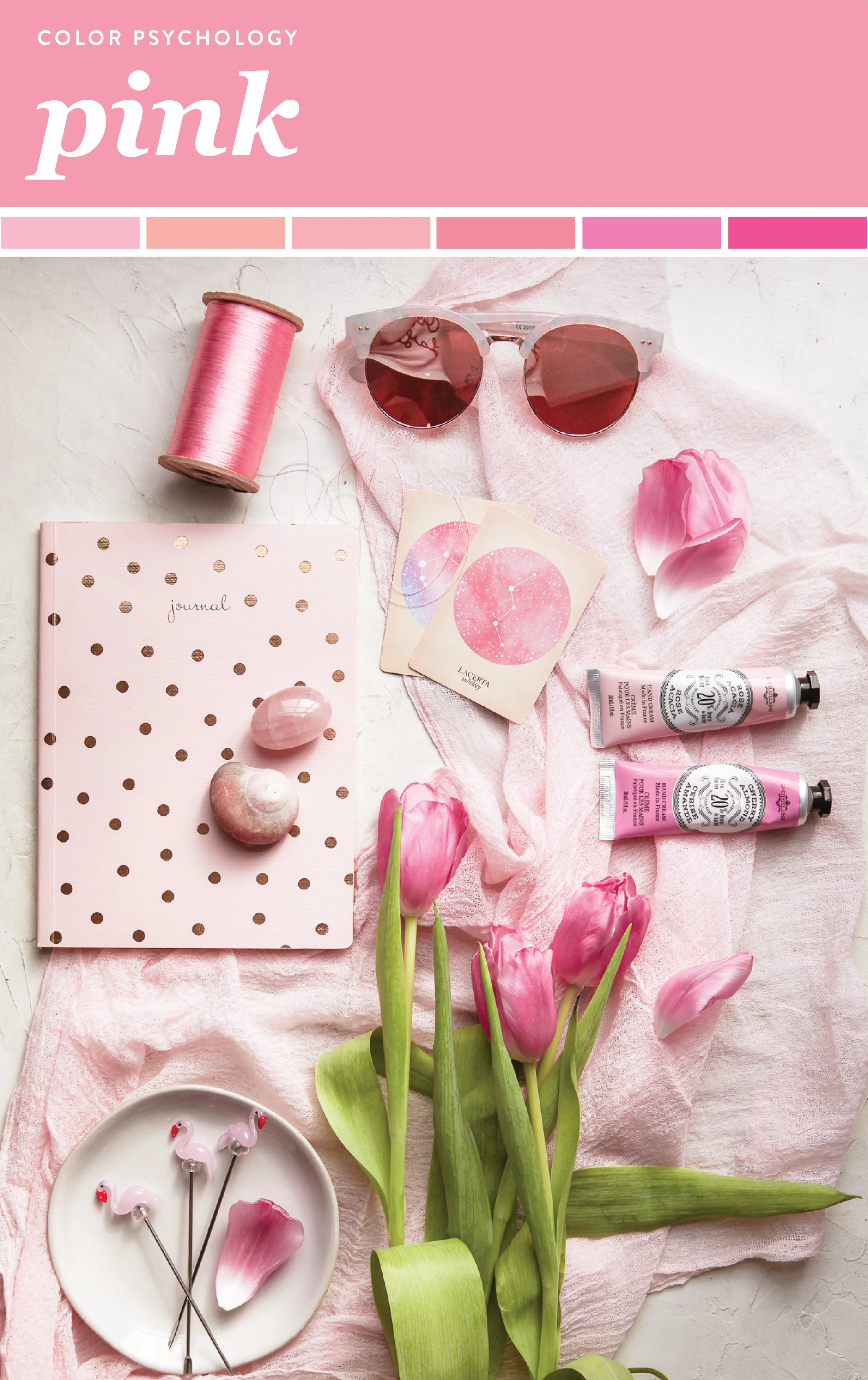
pink color psychology
Like red, pink is related to love. However, while red represents passion, pink stands for tenderness. It also represents positive aspects of traditional femininity like nurturing and kindness, so it’s not only used for romantic love but also familiar love. Its calming effect suggests safety and vulnerability.
This is a color linked to innocence, hope and optimism. But can also sometimes appear as naïve or silly because of its vulnerability and youth, or seeing things through “rose-colored glasses”.
source: www.colorpsychology.org
purple color psychology
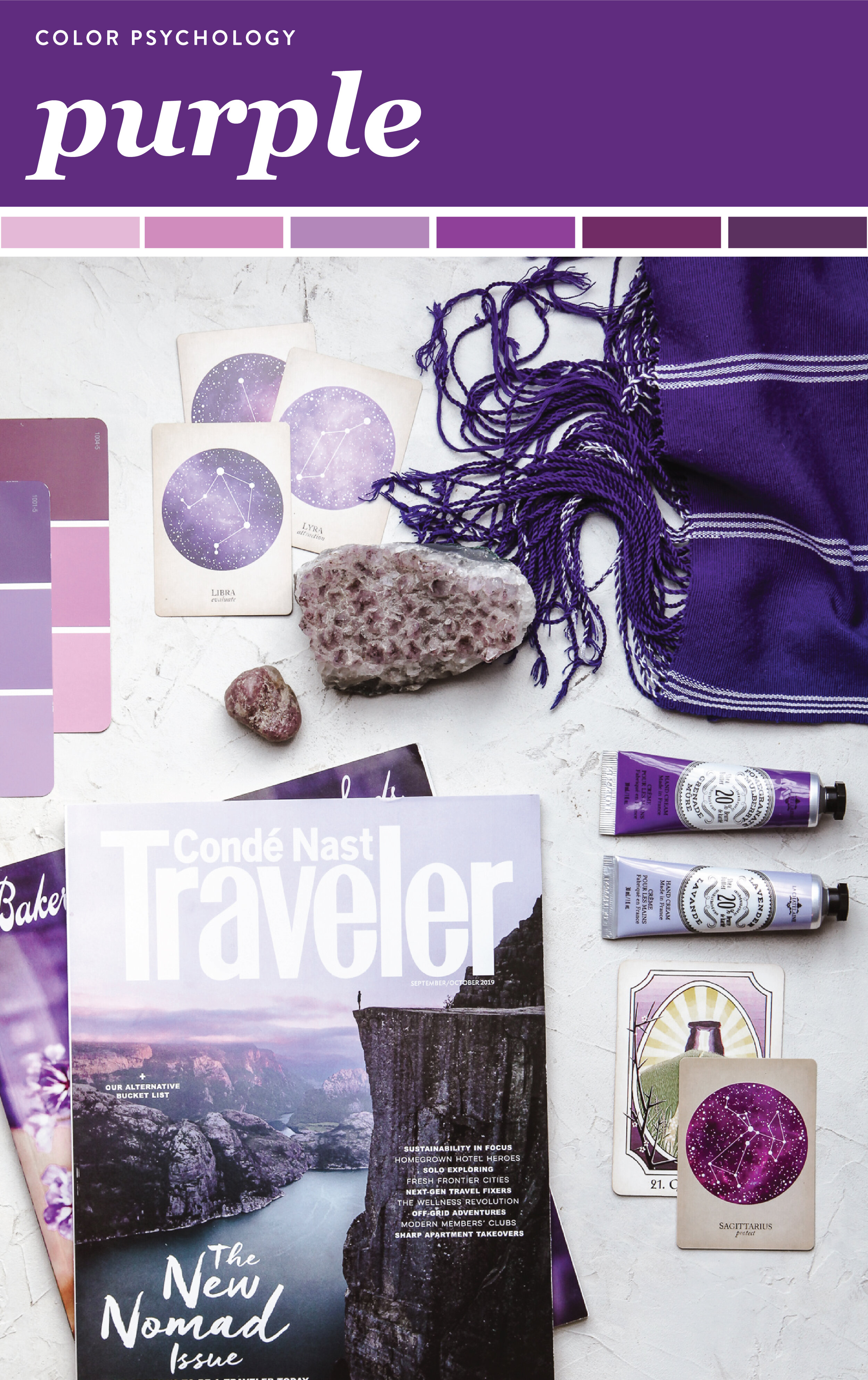
Purple is associated with nobility, luxury, power, wisdom, creativity, independence, and magic. It’s uplifting and can trigger creativity.
Light purple has feminine energy, bright purple is linked with richness and royalty, and dark purple can be associated with sadness and frustration.
In the Chakra colors, purple is the Crown Chakra. It means it governess the mind, the nervous system, and the brain.
source: www.colorpsychology.org

blue color psychology
The color blue is one of the most universally-appealing colors on the spectrum causing a wide range of emotions. Many people find blue to be a calming or soothing color, others feel that it inspires creativity. For a long time, it’s been associated with trust, respect, and dependability. Blue is also linked to confidence without aggression.
Research indicates that the color blue may help lower heart rate and even slow down metabolism, which leads to greater feelings of calm, peace, and serenity. However, it’s coolness can sometimes feel aloof or signify a lack of emotion.
Since there isn’t much food found in nature that is pure blue, it tends to be one of the more unappetizing colors.
source: www.colorpsychology.org

green color psychology
Green is a lively color, symbolizing renewal and growth. It’s the color you see most in nature. The color of spring, when everything comes to life. It also cues balance, calm and harmony.
In chromatic therapy, green is used to soothe the soul and mind. It helps loosen the body from a mental and physical point of view. It is an excellent remedy for states of anxiety and nervousness, helping a person to regain emotional balance and inner calm.
In crystal therapy, gems with green color, like jade or malachite, are used to even out the energies around the emotional center of a being.
source: www.colorpsychology.org

brown color psychology
The color of soil and beautiful pastures, brown represents stability and assurance in our lives.
Brown is reserved and not looking to attract attention to itself. It’s dependable and reliable. Warmer browns feel warm, protective, and secure. Conversely, duller shades may invoke negative emotions such as isolation, sadness, and loneliness.
Some believe this color is too drab or dull. However, that’s the sheer beauty of brown; it gives other colors the opportunity to shine.
source: www.colorpsychology.org

black color psychology
The first association black has is with mystery, the unknown and the hidden. Black is a color linked to secret knowledge and even has a lot of association with magic or esoteric ideas. Black doesn’t usually express many emotions, rather, it conceals them.
It’s a color that’s quite elegant and simple at the same time- used for special occasions or when a person is trying to look a little more appealing to the eye.
Alternatively, it can also be linked to depression and the negative sides of a person or situation.
source: www.colorpsychology.org
Now that you’ve read through them all, any surprises? Does it make you think about your brand colors or the colors associated with some of your favorite businesses differently? Let me know in the comments!

Sarah is a blend of Los Angeles woo-woo meets Midwest practicality. She’s a photographer, design expert, brand strategist, and personal growth enthusiast who helps the culinary and wellness inclined to show up beautifully online. Her career chocolate and peanut butter swirled together when she fell for food photography while designing for some of the world’s biggest consumer packaged goods & retail brands.


