7 tips for next level brand photos

No surprise, I’m an advocate for spot-on brand photos.
That’s because visuals are the fastest way to tell your brand story at a glance.
Consider this: humans have been communicating with each other for approximately 30,000 years, but we’ve only been using the written word for 3,700 years. It’s no wonder our brains are hard-wired to process visual information faster! And that’s not all; 90% of all information transmitted to the brain is visual, and because there’s so much more visual information, our brains can process visuals 60,000x faster than text. (!!!)
See for yourself. Without reading a single caption or line of text (aside from the brand/user name), do you know what these brands are about/ stand for?

Nut Meg Mylk:
Simple ingredients, fresh and pure. An uncomplicated drink that’s easy to take or enjoy anywhere.

Bare Bones Living:
Simple, refined, rustic yet sophisticated aesthetic that appeals to an outdoorsy adventurists.

Beekeepers Naturals
Natural, fresh, vibrant & fun. Honey and pollen that are pure and come straight from the source

Frankie and Jos:
Flavorful ice cream shop that has a natural/ health specialty. (Based on colors + ingredients showcased.)
Pretty powerful, right? So how can you make your brand visuals equally compelling?
Here are a few tips:
One: LIghting is EVERYTHING
I know you’ve probably heard this before, but it’s the god-honest truth. If your lighting sucks, you’re SOL. Do not pass go and think that any of these other tips are going to help you out.
A few things to keep in mind:
Natural lighting is your friend. Get your setup close to a window and learn what times of day have the best lighting. If the light is coming in strong, you’ll want to diffuse it so you get a nice soft, even lighting across your scene. (Unless you’re going for a look that has hard shadows, but that look is a little harder to pull off). You can pick up a diffuser made especially for photography on Amazon. Or, hang a white sheer curtain or sheet on the window to diffuse some of the light.
Once you’ve got diffusion down, you can start learning how to use fill cards. Fill cards are basically just white or black pieces of paper or foam board. If you want your shadows to be deeper/moodier use a black card to suck up some of the light. If your aesthetic is fresh, clean and bright, use a white card to bounce some light back onto your scene and brighten up those shadows.
Feel like you never have enough light? You may need a longer exposure time. Longer exposures let more light onto the scene. The drawback is that any sort of shaking will make your images look blurry or fuzzy. The solution is easy though: set your camera up on a tripod and snap away!

Two: Create mood and feeling with your backgrounds
Colorful backgrounds create a different mood than white backgrounds than patterned backgrounds. Color & pattern can be fun and festive, and sometimes even lend a modern pop vibe. White can be used to create calmness, purity, grace, austerity or a simple clean look.
Does your brand have a natural focus? Experiment with textural backgrounds. Use plaster, concrete, marble or even marbled/painted surfaces to elevate your images. A great way to utilize these backgrounds without having to redo the countertops in your house, studio or shop is to pick up some vinyl backgrounds. They’re durable, you can wipe them off if they get dirty, and roll them up and tuck them in a closet when not in use. (Here are two great places to purchase some: Ink and Elm, and Captured By Lucy.)
Maybe you’re going for an outdoorsy aesthetic. If so, solid or slated wood backgrounds are a great option for your brand.
THREE: Edit, edit, edit
I’ve said time and time again that 70-85% of the magic of my images happens in the edit. Editing is where you can really make your images pop and create a look that is uniquely yours. Play with exposure, contrast, and even coloring or filtering all your images with pre-sets to create your own brand “look.” My hands-down favorite tool for this is Lightroom. Photoshop, or even editing apps on your phone like VSCO, Snapseed, and A Color Story are all great options too.

FOUR: Choose thoughtful props
Before I start shooting for a client, I sit down and think about what kind of story the images are trying to tell. Once I have that in mind, I do a short brainstorm to come up with a list of prop ideas that help tell that story. And you don’t have to go prop crazy. Sometimes a simple flower, leaf, napkin or spoon can speak volumes.
FIVE: Experiment with different setups
Oftentimes, how your scene looks in real life is different than how it comes out of the camera. So don’t be afraid to play, move things around or shoot from a different angle. Always shoot flat lays? Try experimenting with straight on or 45-degree angle shots. Props feel a little too busy? Don’t be afraid to take something out of the scene even if you planned on using it.
You’ll give yourself options to choose from later, and if you have several you like, the extras make great extra social media content.
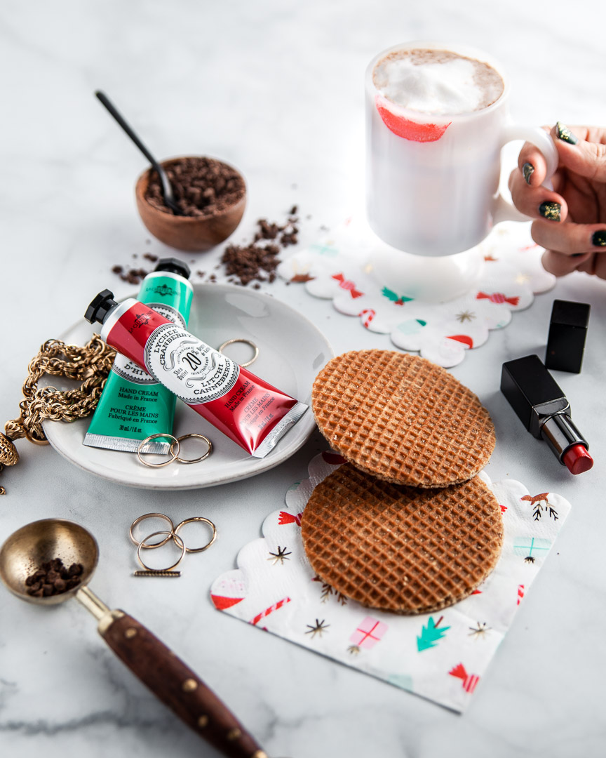
SIX: Add a human touch
Just as our brains are hardwired to quickly interpret visuals, we seek to humanize what we’re looking at. (Ever see a face when looking at the front of a car grill??) So why not bake the human element right into some of your images. A hint of hands holding something or interacting with the scene goes a long way, and how the hand is styled says a lot about your brand too. Is it a male or female? Are the nails painted? If so, what color? What kind of jewelry (rings, bracelets) or shirt is the person wearing? All these little details tell the story of your brand.
You can also hint at human activity without actually showing a person. Show a bite out of something or leftover crumbs. In this image, I intentionally put lipstick on the rim of the glass to show someone was sipping out of it.
SEVEN: Create visual interest with the rule of thirds
Symmetry is a great device for eye-catching images (Wes Anderson basically built his whole visual aesthetic around it.) but it can also get a little boring. Start playing with this little thing called the rule of thirds. Divide your image horizontally and vertically by 3 lines and try to put main elements of your image along those lines and at places where the lines intersect. Our eyes are naturally drawn to these points, so having something there makes your images even more powerful. Bonus tip: On most phone cameras you can turn on a setting that automatically overlays this grid when you’re taking photos, so you can line things up based on the rule of thirds as you’re taking the picture.


